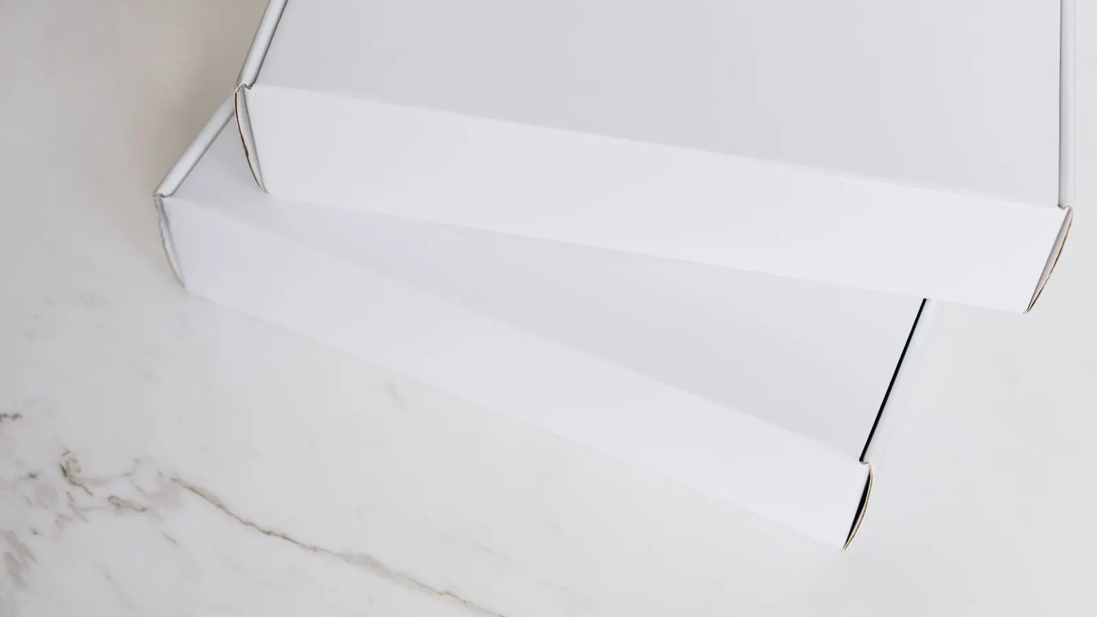
Kraft offers a natural, tactile aesthetic with high visibility, while white board provides a clean, bright canvas for premium branding. The choice depends on product category, shelf environment, and print complexity. Neither is universally superior; the right board matches the visual goal and functional needs of the packaging.
- Kraft board creates a warm, natural impression that suits eco-conscious products and rustic branding.
- White board offers a bright, high-contrast surface ideal for vibrant graphics and clean retail aesthetics.
- Structural performance is similar between the two colors, as board strength comes from the fluting and liner weight.
- Print quality depends on surface finish, not color; a coated liner improves ink adhesion and sharpness.
- Test both materials on the shelf to see how the board color interacts with surrounding products and lighting.
Which board color creates the strongest shelf presence
The first question when selecting a retail display carton is how the board color interacts with the surrounding merchandise. Kraft corrugated has a brown, fibrous surface that reads as natural and tactile. It stands out in stores dominated by white, blue, or glossy packaging. White board, by contrast, presents a neutral, bright field that makes printed colors appear more saturated.
The visual impact depends on the retail environment. In a grocery store aisle with mixed packaging, a kraft carton often draws the eye because of its texture and warm tone. In a beauty or pharmaceutical section, white board usually feels more appropriate, as it aligns with clean, clinical, or premium expectations. The board color sets the emotional tone before the customer reads the label.
This choice is not just about aesthetics. The board color influences how the product is perceived. Kraft suggests sustainability, simplicity, and honesty. White suggests purity, precision, and modernity. A brand that markets itself as organic may use kraft to reinforce that message. A brand that emphasizes technical performance may use white to signal clarity and control.
How structural performance compares between the two materials
Kraft and white corrugated differ in appearance, but not in basic structural mechanics. The strength of a corrugated carton comes from the fluting pattern and the weight of the linerboard, not the color of the paper. A double-wall E-flute kraft carton and a double-wall E-flute white carton will have similar burst strength, stacking capacity, and resistance to crushing.
The main structural difference is the surface quality of the linerboard. White board is often produced from a more refined, brightened paper that accepts ink with a clean, even finish. Kraft board may have a more textured surface with visible fibers, which can give a slightly softer ink impression. This difference matters more for print quality than for load-bearing performance.
When handling heavy or fragile products, the fluting profile and board thickness are the primary factors. A thicker E-flute or F-flute will provide more cushioning and stiffness. The color of the liner does not change how the corrugated flute folds, glues, or resists compression. A supplier can produce both colors in the same flute configurations and with similar weight ranges.
Print quality and finishing options on each board type
Print quality is where the choice between kraft and white board becomes more technical. White board typically has a smoother, brighter surface that works well with high-resolution digital printing or offset printing. It allows for crisp text, fine lines, and vibrant spot colors. The bright background makes dark inks appear sharper and bright colors appear more intense.
Kraft board can also be printed on, but the effect is different. The natural brown tone and visible fiber texture give the print a softer, more integrated look. Dark inks, such as black or deep brown, often look particularly strong on kraft. Light colors may be harder to make stand out, as the background tone is already warm and busy.
For complex graphics, white board is generally easier to manage. A multi-color label with gradients and small text will often look cleaner on white. For simpler graphics, such as a logo, a product name, and a few key icons, kraft can work well and even look more distinctive. The surface finish of the board, whether matte, gloss, or soft-touch, also affects how the ink sits and how the customer feels the package.
A practical test is to print the same artwork on both board types and view them under the actual store lighting. Fluorescent lighting can wash out white board, while warm lighting can enhance the brown tone of kraft. The board color should be evaluated in context, not in isolation.
Retail display and shelf impact
In a retail display, the carton is part of a visual system that includes the product, the shelf, the lighting, and the competing products. Kraft corrugated brings a tactile quality that can make a product feel more grounded and natural. It works well for food, beverage, home goods, and eco-conscious brands. The texture of the board invites the customer to pick up the package and feel the material.
White corrugated creates a cleaner, more modern look. It is common in electronics, personal care, and specialty retail. The bright surface allows the product itself to be the focus, with the packaging acting as a neutral frame. For brands that use a strong logo or a bold color block, white board provides a high-contrast backdrop that makes the design pop.
The choice also depends on the shelf layout. If products are displayed in a dense grid, a kraft carton may break up the visual monotony. If products are displayed in a sparse, high-end setting, white board may blend better and feel more cohesive. A supplier can help simulate the display by producing a small batch of both colors and placing them on the actual shelf.
Cost and lead time considerations
The cost difference between kraft and white corrugated is usually small, but it can vary based on the specific board grade and finish. White board may require more processing to achieve a bright, smooth surface, which can add to the material cost. Kraft board is often produced with less chemical treatment, which can keep costs lower. However, these differences are not always consistent across suppliers or regions.
Lead times can also differ. If a supplier has standard stock of one color but not the other, the lead time for the less common color may be longer. A custom color or finish may require additional setup time. It is worth confirming the availability of both board types with the supplier before finalizing the design.
For most retail projects, the cost difference between the two colors is not the deciding factor. The deciding factors are the visual goal, the product category, and the brand identity. A brand that wants a premium, clean look may choose white board even if it costs slightly more. A brand that wants a natural, sustainable feel may choose kraft board and accept the different print behavior.
When to choose kraft corrugated
Kraft corrugated is the better choice when the brand wants a natural, tactile impression. It works well for organic foods, artisanal products, outdoor gear, and any product that benefits from a sense of authenticity. The visible fibers and warm tone create a connection to the raw material. It also pairs well with simple, minimal packaging designs that rely on the board color as part of the visual identity.
Kraft is also a good choice when the product is displayed in a environment with lots of white and glossy packaging. The contrast can make the product stand out. It is less ideal for brands that require a very clean, clinical, or high-tech look. If the packaging has fine text or complex graphics, white board may be easier to read and reproduce.
When to choose white corrugated
White corrugated is the better choice when the brand wants a clean, bright, and modern appearance. It works well for electronics, personal care products, pharmaceuticals, and any product that benefits from a sense of purity and precision. The bright surface makes printed colors appear more vibrant and allows for high-resolution graphics without the distraction of fiber texture.
White board is also a good choice when the packaging is part of a larger retail display system that uses a consistent color palette. It blends well with white fixtures and lighting. It is less ideal for brands that want a rustic or eco-friendly feel, as the bright surface can feel too clinical or impersonal. If the packaging is intended to be kept by the customer as a storage container, kraft may feel more inviting and reusable.
Comparison table
| Option | Best for | Limitations |
|---|---|---|
| Kraft corrugated | Natural, tactile branding; eco-conscious products; rustic or artisanal goods | Can look less clean or clinical; fine text may be harder to read; limited contrast with light colors |
| White corrugated | Clean, modern branding; high-resolution graphics; personal care, electronics, pharma | Can feel impersonal or clinical; less tactile; may blend in with white fixtures and lighting |
| Coated kraft | Brands that want the natural look with better ink adhesion and a smoother finish | Higher cost than standard kraft; less rustic texture; may reduce the tactile feel |
| Coated white | Brands that want a premium, smooth finish with high print quality | Can feel less natural; higher cost; may not align with sustainability messaging |
| Recycled kraft | Brands that want to emphasize sustainability and use recycled materials | Surface quality can vary; may have a more irregular texture; limited print options |
Final decision framework
The decision between kraft and white corrugated is not about which is better. It is about which fits the brand, the product, and the retail environment. Start by defining the visual goal. Do you want the packaging to feel natural and tactile, or clean and modern? Next, consider the print complexity. Do you have fine text and high-resolution graphics, or a simple logo and a few key messages? Then, evaluate the shelf context. How does the board color interact with the surrounding products and fixtures?
A practical approach is to request samples of both board types and print the actual artwork on each. View them under the intended store lighting and place them on the shelf next to the product. Ask the customer to pick up both and see which one feels right. The board color is a small part of the total packaging experience, but it sets the tone. Get it right, and the rest of the design will work harder.
Frequently asked questions
Which board color is better for eco-friendly branding?
Kraft corrugated is generally preferred for eco-friendly branding because its natural, fibrous appearance aligns with sustainability messaging. White board can also be made from recycled materials, but the bright, smooth finish can feel less natural.
Can white corrugated be printed with high-resolution graphics?
Yes. White board has a smooth, bright surface that works well with high-resolution digital or offset printing. It allows for crisp text, fine lines, and vibrant colors that may be harder to achieve on kraft.
Is there a significant cost difference between kraft and white corrugated?
The cost difference is usually small and varies by supplier, board grade, and finish. White board may cost slightly more due to the processing required for a bright, smooth surface. For most projects, the cost difference is not the deciding factor.
Which board is better for products with fine text?
White board is generally better for products with fine text. The bright, smooth surface provides higher contrast and clarity for small lettering. On kraft, fine text can be harder to read due to the fiber texture and darker background.
Can I use both colors in the same packaging line?
Yes. Many brands use kraft for one product line and white for another to differentiate categories or create a visual hierarchy. The key is to ensure the board colors align with the overall brand identity and retail strategy.